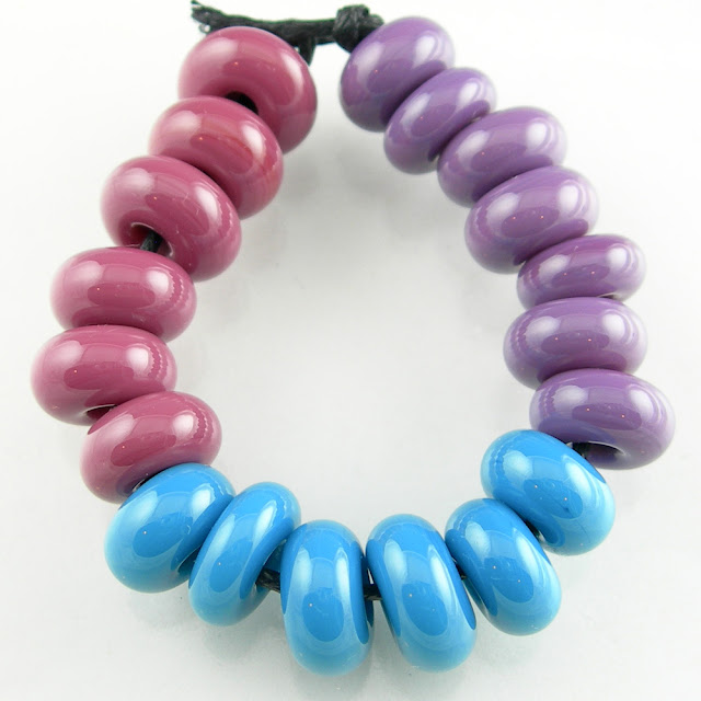
Color Palettes: Primary Pop
Soft Glass Color Inspiration
What better way to re-ignite your color muse than to go back to the very basics. Why are rainbow color palettes so thoroughly pleasing to the eye?
The primary colors.
There is just something about red, yellow, and blue ... and the rest of their 2nd tier friends that makes your heart sing just a little bit. And perhaps bring out that childhood joy elicited from your first fresh box of Crayola crayons.
While those colors together might be a little too bold for your home decor, a slight deviation in tonality and suddenly you've got a bohemian or rustic flair.
From a fashionista standpoint, what better way to complement that chic black and white outfit than to add a bold ensemble of jewels in the primary color palette?
And quite frankly, if you are even the slightest fan of pop or modern art you simply have to incorporate the primary colors in there a bit. Try it. I think you'll like it.
These base glass colors were used in the beads:
- Effetre 212 Pea Green
- Effetre 232 Light Turquoise
- Effetre 240 Light Lapis
- Effetre 418 Yellow
- Effetre 420 Orange
- Vetrofond 076 Transparent Red
Looking for more glass color combinations and layering recipes? Download my color recipes e-book or check out these additional blog posts:


Comments
Post a Comment