Posts

Color Palettes: Primary Pop

Image
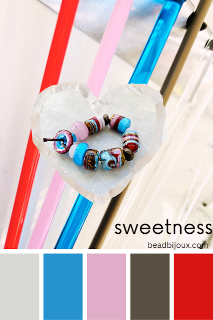
Soft Glass Color Inspiration What better way to re-ignite your color muse than to go back to the very basics. Why are rainbow color palettes so thoroughly pleasing to the eye? The primary colors.   There is just something about red, yellow, and blue ... and the rest of their 2nd tier friends that makes your heart sing just a little bit. And perhaps bring out that childhood joy elicited from your first fresh box of Crayola crayons. While those colors together might be a little too bold for your home decor, a slight deviation in tonality and suddenly you've got a bohemian or rustic flair. From a fashionista standpoint, what better way to complement that chic black and white outfit than to add a bold ensemble of jewels in the primary color palette?  And quite frankly, if you are even the slightest fan of pop or modern art you simply have to incorporate the primary colors in there a bit. Try it. I think you'll like it. These base glass colors were used in the beads: Effetre 212 Pe

Color Recipes: Mix Match Make

Image
Have you ever found yourself at a loss for what to make?  Do you struggle putting together color combinations? Are you looking for ideas on what colors go good together? Introducing my first e-book for lampworking.  A collection of some of my favorite bead designs with color recipes by manufacturer. Including my favorite color schemes and combinations along with working tips and studio notes on how I use color theory to achieve winning bead combinations. Come along on a colorful journey with me as we look back on some of my favorite and most popular combinations over the years, with all the glass colors listed in detail by manufacturer name and number. In my first e-book I share recipes to 37 different sets of beads along with snippets on color theory and how to pick winning combinations in glass. This book contains 23 pages of information. This e-book does not teach any specific technique, nor does it include any general information about lampworking safety and setup. Basic beadmakin

Color Palettes: Mid-Century Modern

Image
Soft Glass Color Inspiration Is there a more quintessential color scheme that represents the mid-century modern vibe as well as teal and ocher yellow? No. There is not. My second choice would be throwing down some orange and ocher green with a coffee brown, but if we are to take the vibe of mid-century modern and match it up against the current 'everything is gray' trend ... then teal and yellow wins. While the glass beads don't contain any actual gray, after I snapped the photo [ against a gray backdrop ] I had a moment ... and realized the overall combination made the most perfect mid mod color palette. swoon . And if I'm being transparent, this palette matches my current home decor so it needed to be made into a color swatch.  If you are looking for paint colors that might match this vibe ... consider Benjamin Moore Citrus Burst or Chartreuse for the ocher, and Oceanfront or Caribbean Cool for the teal. Stonington Gray looks good with both. Pretty close match would

Striking Glass: How to Get Color

Image
Lampworking Tips & Techniques Any lampworker who has ever attempted to work with 'striking' glass has experienced the struggle. How do you get all those fabulous color ranges and not just boring tan? Not that tan is a bad color ... but when you spend a small fortune on premium striking glass, tan is not the desired outcome. If we go way back into the glass time machine, the whole striking glass frenzy started with a furnace glass:  Reichenbach R-108 Iris Orange - lovingly nicknamed 'Raku' by the lampworking community ...  now I'm sounding like a food blogger 😉 There have been countless forum threads, e-books, tutorials, and conversations around how to get Raku to do its magic. Every single one of them has excellent information that anyone who chooses to work with this glass will benefit by reading and watching. I am no expert. I still can't get the full color range I want out of this glass after all this time. However, if we break down the already kno

Color Palettes: How to Incorporate Brown

Image
Lampworking Glass Color Reference Brown has not been a trendy color in glass for quite some time ... except with those beadmakers who make adorable critter beads or decadent sweet treats. It has been difficult to find brown clothing as well. It seems when grey became the new ' it ' color for literally everything from fashion to home decor, brown ceased to exist. Trying to find a nice pair of dark brown slacks has been next to impossible. I've all but given up and banished my blouses that need brown slacks to the back of the closet. For those of us whose natural skin and hair coloring pairs better with warm palettes over cool palettes, the struggle is real. I actually prefer grey and cool tones myself, but my person looks better in warm colors. So for the other warm palette people out there like me, I'm single-handedly bringing brown back in style. And if the rest of the world chooses not to hop on board that is okay. At least folks looking for warm colors know they ca

Christmas Joy

Image
Lampwork Glass Colors for Christmas Designs Is there a more quintessential combination of colors to represent Christmas than the traditional emerald green and ruby red? Nope. There is not. I've done the whole 'vintage' Christmas theme with more muted burgundies and olives. A deep maroon and hunter green also work well with traditional home decor. Lime green is always a fun twist to brighten things up - especially if you are fond of the grinch. My personal preference is icy blue and white with snowflakes and icicles ... because I like to match my love for all things blue - even when it comes to holiday decor. Metallic golds and silvers always reign supreme and when it comes to glitzing things up for Christmas, the more sparkles the better. Ironically emerald green and ruby red are two colors that I never gravitate towards. Ever. I bought 1/4 pound of these colors when I first started lampworking (15 years ago) and I STILL have some left. That is how infrequently I use them.

Color Palettes: What to Pair with the Color Red

Image
Lampworking Soft Glass Color Reference Red is not a color I tend to gravitate towards. Whenever I pull it from my glass stash I usually just stare at it aimlessly trying to figure out what to pair with it. Then it goes back in its little cubby ... until I feel guilty that it never gets attention like the other colors do ... and I pull it out again,  only to repeat the cycle . But Fall is another story. When mother nature paints a gorgeous picture outside your window full of reds and yellows and greens and blues, then you know it is time. The red glass will have its day. Red, orange and yellow are a natural pairing as they are on the same side of the color wheel. Red and turquoise have been a popular combination for southwest designs. Red and green are together frequently at Christmas. But put them all together and it's like the most perfect woolly sweater ever made. It's as if Fall just opened up the gates and poured itself all over the studio. And really, who doesn't swoo

Recent Etsy Listings